Line chart- compare different but related datasets. Display trends and show how data values change in relation to a continuous variable eg time.
- Used to show information as a series of data points connected by straight lines.
- Horizontal axis typically represents time or a similar category. Vertical axis represents numerical values.
- Perfect for showing trends in data at equal time intervals eg days, months, years
- Display continuous data over a given time period.
- Ideal for scenarios where you have data that's arranged in columns or rows or data contains multiple data series.
Pie chart- can show breakdown of an entity into its sub parts. The proportion of the sub parts in relation to one another. Each portion represents a static value or category. Sum of all categories equals 100%
- A type of circular graph used to show relative contribution of different categories to make an overall total.
- Data points are represented as percentages of the complete pie.
Bar charts - most common and easy to create. Great for comparing related data sets or parts of a whole.
- A type of graph used to compare values across categories either using horizontal bars or vertical bars.
- Categories are usually on the vertical axis and values on the horizontal.

Stacked bar charts - each bar is sub divided into sub bars that are stacked end to end.
Column charts - show change over time. Compare values side by side. Better suited for showing negative and positive values.
- Categories are on horizontal axis while values are on vertical axis.
Tree maps - useful for displaying complex hierarchies using nested rectangles. Size reps population and color employment rate.
- Compare values across hierarchy levels.
- Show proportions as rectangles.
- Good way to display lots of data in one graphic.
- Color, size and closeness of shapes represents hierarchical data categories.
Funnel charts - display a pipeline or different stages of a continuous process.
- Used to show progressively smaller stages in a process.
- Suitable for data which shows progressively decreasing proportions.
Scatter chart - circle colors rep categories of data, circle size indicate volume of data. Used to reveal trends, clusters, patterns and correlations between data points.
- Compare 2 sets of numerical data values and show relationship between them.
- Compares 2 sets of y and x axis values into single data points.
- Displayed in clusters
- Also called xy charts.
- Commonly used to compare, statistical, scientific and engineering data values.
Bubble charts - variant of scatter chart. useful for comparing a handful of categories to one another in terms of relative significance.
Sparklines - do not include an axis or coordinates and yet display trends simply and effectively. Great for showing the general trend of a variation.
- Mini charts placed inside single cells to represent a selected range of data.
- Typically used to show data trends such as seasonal increase-decrease, economic cycles and share, rate or price fluctuations.
- Can also be used to high max-min values.
- Provides greatest impact when placed close to the data it represents.
Histograms - show distribution of data grouped into 'bins'. Look similar to bar charts but are very different. Bar charts compare data while histograms display data distribution.
Filled map chart - compare values and show categories across geographical regions. Suitable for data which contains geographical regions like countries, states or postal codes.
Waterfall chart shows cumulative effect of a series of positive and negative values. Suitable for data which represents inflows and outflows like financial data.
Stock chart - used to show the trend of stock's performance over time. best suited to data with a series with multiple stock price values like volume, open, high, low and close.
Surface chart is used to show trends in values across two dimensions in 3D surface areas or 2D contoured charts. Most suitable when categories and data series are both numeric.
Radar chart is used to show values relative to a center point and is most suitable when categories are not directly comparable.
DASHBOARDING
Data analysis dashboards provide key information in one place. They provide user interaction capabilities eg filters, slicers, timelines and map charts. Users get consolidated and visualized insight into their most important business data and KPIs. users get a controllable self-service BI interface. They are typically created in a data analysis application by using multiple pivot tables and charts. Pivot tables and charts could be created form a single data source or multiple data sources.
Benefits of a dashboard.
- Offer insights into your data.
- Can alert you to trends and data.
- Provide an interactive experience using filters.
- Dynamically updated as data changes.
- Provide a centralized consolidated view of business data.
- Collect and organize data
- Verify your data is clean, error-free, has no blank rows or columns
- Format your data as a table.
- Create pivot tables.
- Create several visualizations to populate your dashboard with eg charts, maps, slicers.
Tasks to perform:
Total Incentives by Branch - as a bar chart, sorted in either ascending or descending order of Total Incentives, and change the chart title to Total Incentives by Branch. (Hint: Use the pivot table on Sheet1 to create the chart, and use Format on the Chart tab to change the chart title.)
Risk Score and Total Incentives by Period Description- as a line chart, and give the chart a title of Risk Score and Incentives by Period. (Hint: Use the pivot table on Sheet2 to create the chart, and use Chart Title on the Chart tab to add the chart title.)
Complaints by Period description using Branch as filter – as a column chart and give the chart a title of Complaints by Period for All Branches. Use the filter for Period Description to show complaints for only October and November. (Hint: Use the pivot table on Sheet3 to create the chart, and use Chart Title on the Chart tab to change the chart title.)
Total Incentives by Region Name and Branch ID – as a column chart and give the chart a title of Incentives by Region Name and Branch. Also, remove the horizontal gridlines from the chart, put the legend on the left side of the chart, and color the series outline in green. (Hint: Use the pivot table on Sheet4 to create the chart, use Gridlines in the Axes group on the Chart tab to remove the gridlines, and use Format on the Chart tab to change the chart title, move the legend, and format the series outline color in green.)
Save your workbook: Use Save As to save your completed workbook as Incentive_Compensation_Management_Conduct_Risk - End.xlsx.
Software Used in this Assignment
The hands-on lab in this assignment will use the trial version of Cognos Analytics from IBM.
Dataset Used in this Assignment
The dataset used in this lab comes from the following source: https://community.ibm.com/accelerators/?context=analytics\&type=Data\&product=Cognos%20Analytics\&industry=Banking in the IBM Accelerator Catalog. The Terms of use for such are located at https://developer.ibm.com/terms/ibm-developer-terms-of-use/.
Accessing the Dataset Used in this Assignment
- The dataset used in this final assignment is provided as sample data within your Cognos environment, in a data module called Incentive Compensation Management Data Module.
To load and open the data module:
On the navigation panel of Cognos Analytics, select Team content and then select Samples.
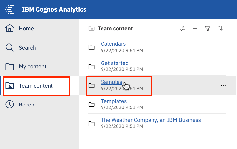
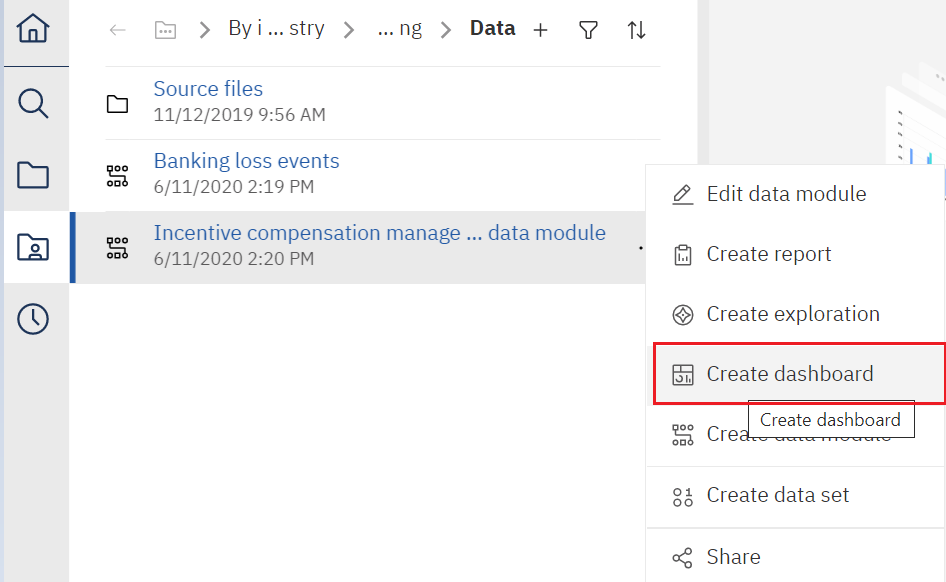
Now, select Go By Industry > Banking > Data > Incentive Compensation Management Data Module.
Here, the sample data used in this final assignment can be found, in a data module called Incentive Compensation Management Data Module. Right-click Incentive Compensation Management Data Module and select Create Dashboard.
Guidelines for Submission
Use the course videos and hands-on lab from Module 2 Creating Dashboards Using IBM Cognos Analytics to help you complete these tasks.
Tasks to perform:
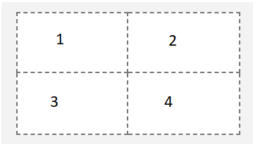
• Create one dashboard using the 2 x 2 rectangle areas tabbed template. Rename this dashboard tab to Compensation on Period.
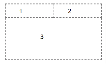
• Create one dashboard using the tabbed template that has 2 small rectangles at the top and a large rectangle below. Rename this dashboard tab to Risk Analysis.
On the Compensation on Period dashboard, capture the following KPI metrics as visualizations:
In the first small rectangle (Panel 1), capture the Risk Score and format it to 2 decimals.
In the second small rectangle (Panel 2), capture the Branch Average.
In the third small rectangle (Panel 3), create a bar chart that captures Total Incentive by Period. Display the values on the bar chart with no grids.
In the fourth small rectangle (Panel 4), create a line chart that captures Branch Average by Period. Display values on the line chart with no grids.
On the Risk Analysis dashboard, capture the following KPI metrics as visualizations:
In the top left area (Panel 1), create a scatter plot that captures Region by Complaints with points for Education and Region Name and then title the plot Complaints by Customer Advisor Education Level. (Hint: Use Region on the x-axis, Complaints on the y-axis, and use Education and Region Name for points.)
In the top right area (Panel 2), create a line chart that captures Protected Customers by Period, colored by Region ID and Region Name, and then title the chart Protected Customer Transactions by Year. (Hint: Use Period for the x-axis and Protected Customers for the y-axis and then color it with Region ID and Region Name.)
In the bottom left area (Panel 3), create a scatter plot that captures Total Incentive by Risk Score with Branch for points and color. Then, title the plot Metric by Calendar Year. (Hint: Use Total Incentive for the x-axis and Risk Score for the y-axis, and Branch for color and points.)
To export your dashboard as a PDF, follow the instructions below:
- On the application toolbar of your dashboard page, click the Share icon.

- On the Export tab, check Include filters and the click Export

- On the Print pop-up page, in the Destination drop-down list, select Save as PDF.
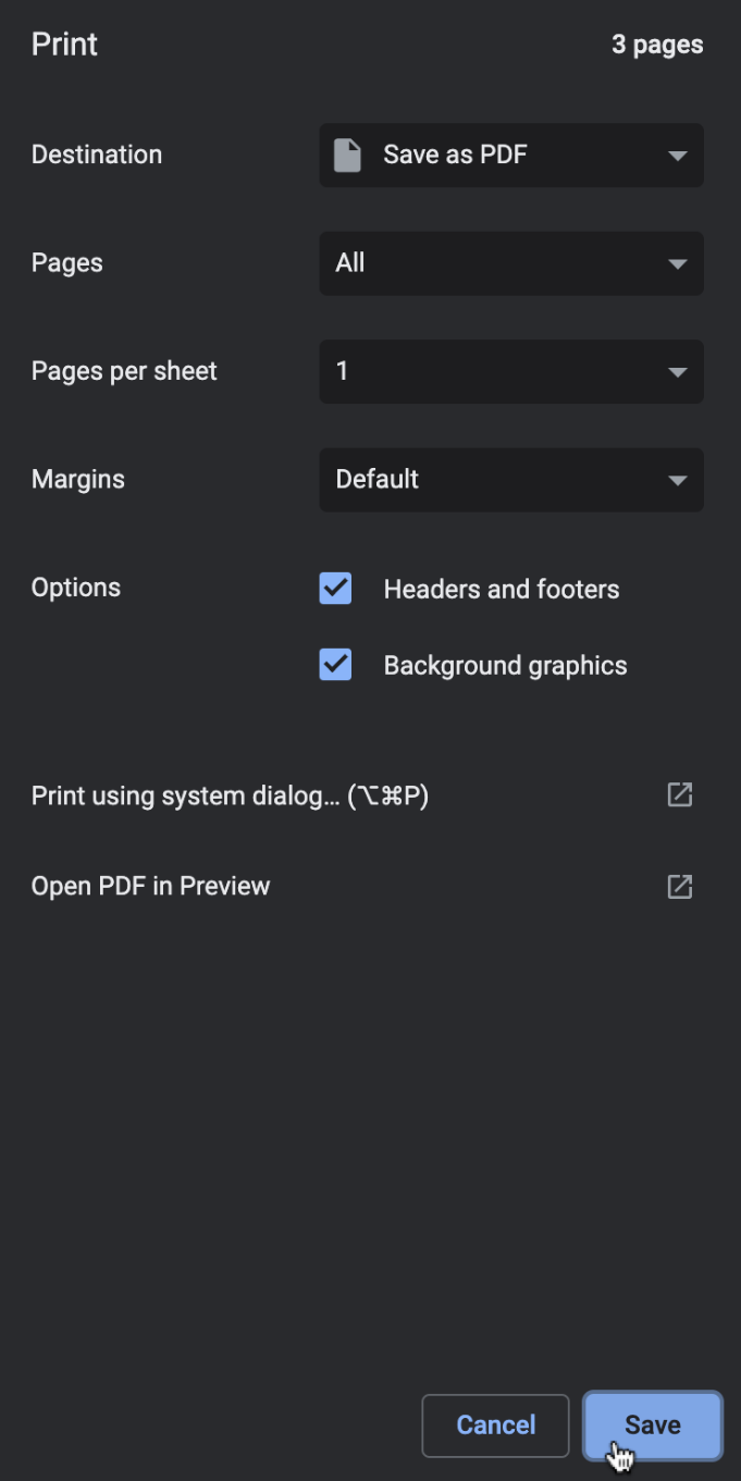
- Save the PDF file on your local machine to any location you like (preferably your Downloads folder) for later upload and submission to the Coursera platform.
Grading Information
For your assignment to be graded in a subsequent step in the course, you will be required to upload the PDFs of your Cognos Analytics dashboards that you exported to your Downloads folder in Task 4. You will upload these exported PDFs to the edX platform as part of your submission. (Important: If you cannot export your dashboards as PDFs for any reason, then you must take screenshots of your two dashboards, and submit these for grading instead).
إرسال تعليق